Archive for the ‘Uncategorised’ Category

Check up on financial advisors before hiring them – it’s easier than you think

Friday, January 10th, 2014

Financial advisor titles are generally unregulated in Canada (Québec being the exception).  Designations – denoted by the letters after advisors’ names on their business cards – can be downright confusing.  Some are earned only after a few years of relevant experience and a rigorous educational program while others are granted after just a few days of classroom study.

Fortunately, the internet has become a handy tool for doing basic but critical due diligence on most people dispensing financial advice in Canada.  Securities regulators, insurance regulators and organizations governing financial designations all have online searchable databases that allow you to check out an advisor.

This is a basic step that requires little financial knowledge but can save a lot of stress.  Unless someone is a pure financial planner – i.e. they do not handle any products or implementation for clients – there isn’t a good reason for an advisor to operate without a license.  And anyone holding themselves out as professional advisors should have one or more professional designations.  Making these non-negotiable requirements can save you a lot of headaches and money.

The story of Earl Jones serves as a useful example.  Jones was neither licensed nor the holder of any recognized credential.  Requiring one or both would have prompted discriminating investors to avoid him.  While that’s no guarantee to steer everyone clear of fraudsters, the following websites should make it easy for Canadians to do lots of important due diligence with just a few clicks.

Securities Regulators

To find all those licensed to sell or advise on any kind of investment product (i.e. excludes insurance and deposit/banking products), there is a national search functioncourtesy of the Canadian Securities Administrators – to verify licensing of any person or company registered to sell or advise on investments in Canada.

In addition, the Investment Industry Regulatory Association of Canada (IIROC) has a search of its registrants and disciplinary actions.  Similarly, the Mutual Fund Dealers Association of Canada has a good enforcement site that lists advisors that have been the subject of disciplinary actions (organized by current and archived cases).  The Ontario Securities Commission aggregates some of this information on its own website to make this a bit easier.

Insurance Regulators

While there isn’t a centralized national insurance licensee database, each jurisdiction has a good search function.  In Ontario, visit the Financial Services Commission of Ontario which allows users to search for insurance agents, insurance companies, corporate insurance agencies, brokerage firms or partnerships and individual insurance adjusters and adjustment companies.  There are similar search functions available for Alberta, British Columbia, Manitoba, New Brunswick, Newfoundland & Labrador, Nova Scotia, Prince Edward Island and Québec.

Industry Designations

All of the above links cover people and companies with a license to provide investment advice or to sell investment and insurance products to Canadians. Financial planning is not regulated and so requires no license (except in Québéc).  So you have to rely on the organizations running and overseeing professional designations to confirm if an advisor you’re considering in fact holds one or more of the many financial designations available.  Examples include:

There are too many other financial industry designations to list but some offered by the insurance and financial planning industries may be worth looking at – if for no other reason to see how easy and quick it is to obtain some of these designations.  To get a sense of what’s involved in getting the various letters you see on many business cards, the IIROC maintains a list of a dizzying number of financial designations with some good information.

The most dangerous advisors are those without a license of any kind because they’re not on regulators’ radar.  If you’re computer literate or know someone who is, it’s a must for individuals to do some basic checks before handing over any money to an advisor.  The above links should facilitate the process and improve your odds of avoiding the industry’s more ethically-challenged contingent.

==============================================

Post script (13-Feb-2014):  Ken Kivenko has pointed me to a website listing subjects of Canadian Insurance Regulators’ Disciplinary Actions.  This is a great centralized database showing recent decisions on the main page; but it also contains a search function to check the full database.
Industry risk rating failing investors of floating rate note funds

Tuesday, September 17th, 2013

Floating rate note (FRN) funds are gaining in popularity because of their marketed ‘promise’ to protect capital during periods of rising interest rates.  In Canada since the mid-2000s, FRN funds invest mainly in corporate loans bearing a fluctuating interest rate.  They appeal to investors who fear rising interest rates – which is most – but offer competitive current yields.

Investors seduced by this class of funds should be aware that hedging one risk often heightens exposure to other risks.  And standard industry risk ratings fail to communicate this trade-off, which risks significantly understating these funds’ true risk exposure.

Floating Rate Notes

FRNs are issued mainly by corporations and, to a lesser extent, governments.  Rather than a fixed rate of interest, FRN issuers (i.e. the borrowers) pay an interest rate equal to some benchmark interest rate like treasury bills or LIBOR (London Interbank Offering Rate) plus some premium.

Banks are major issuers of FRNs, which may be partly explained by the growth in consumers’ variable rate borrowing (e.g., variable rate mortgages).  Accordingly, banks may offset this variable revenue stream with debt obligations with similar characteristics.  This kind of matching makes sense.

While FRNs offer protection against rising rates, the largely-corporate profile of FRN issuers (including a good proportion of below-investment grade companies) means that FRN fund investors are assuming a good deal of credit risk.  A significant but less concerning risk is the falling returns that would result in a falling interest rate environment.

These risks are not reflected in fund risk ratings in Fund Facts disclosure documents.

FRN Fund Risk Ratings

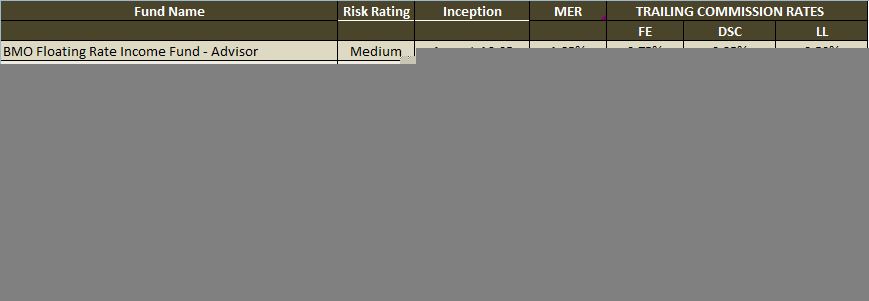
Each fund’s prospectus and Fund Facts disclosure document contain a risk rating.  The table below shows a summary of the existing group of FRN funds along with associated risk ratings and trailing commission rates.  (Click on the below table to enlarge it.)

FRN_Funds_201309

Two things stand out from this table.  First, risk ratings vary quite a bit for a pretty similar group of products.  Most risk ratings cluster in the middle of the range.  Second, fees and commissions are even more diverse than the funds’ risk ratings.

Standouts include Renaissance, which offers the highest trailing commissions among this group; and O’Leary which sports the lowest risk rating and among the highest commissions.

But these risk ratings are striking in the face of the return history of this asset class.

Historical Downside Risk

Two Canadian FRN funds have been around long enough to experience a bear market.  And both funds suffered significant downside as shown by calendar year returns for both the Trimark and BMO FRN funds.  Bear market losses just a few years ago were more equity-like than of the variety normally associated with lower risk investments.

Trimark Floating Rate Income fund lost 27% of its value during the financial crisis – significant but not insurmountable.  The fund has fully recovered, having long surpassed its previous peak.  But BMO Floating Rate Income fund is different story.

BMO’s fund lost nearly half of its value – more than many stock funds – and remains under water as of August 31.  Its previous peak is more than seven years into the past.  It’s no surprise that BMO Floating Rate Income sports the highest risk rating of its peers.

But it’s a general failing of the industry’s accepted risk rating method that “medium risk” is equated with losing half of your money and waiting the better part of a decade to recover.  This critique applies to most funds, not just FRN funds.

O’Leary Funds serves as another interesting example.  While its two-page Q&A document serves as a sales brochure for its new FRN fund, it includes more than 20 years of FRN index history – which shows a 29% loss for calendar 2008.  But its risk rating is based on the index performance over the past three years – a very bullish environment for all forms of fixed income before this spring.

Industry Risk Ratings Need Improvement

My critique of the fund industry’s approved risk rating method is not new.  Six years ago – before the worst of the financial crisis – I took the industry to task for its meaningless risk and suitability ratings.  Then as now, Fund Facts’ oversimplification of these two ultra-important factors does not tell investors what simple numbers can clearly communicate.

Fund sponsors should use sufficient history (of the fund or its benchmark) to include at least one bear market in assessing a fund’s risk rating for investor disclosure documents.  Investors may not immediately comprehend credit spreads and spread compression.  But they understand losing money – and that’s what the industry should be showing them before they invest.

Predictions, Stocks Markets & the Weather Rock

Monday, July 29th, 2013

I had the pleasure of dining with a group of friends recently at one of the fine wineries along Lake Erie.  Near the entrance was a rock hanging from a chain – i.e. a “weather rock”.  One of our friends explained how it works.  When it’s wet, there is rain.  When it’s white, it’s snowing.  And when it’s swinging, it’s windy.

Noting that it’s easy to predict the past, another astute member of our group asked if my HighView partners and I were good at financial predictions.  I remarked that we’re definitely better than the weather rock.  This reminded me that forecasting is an ironic and humbling exercise.  The irony:  short-term predictions are notoriously more difficult than longer-term forecasts.

When asked for shorter-term predictions, I always respond candidly that I can guess what’s going to happen from year to year but I don’t know.  Nobody does despite the proliferation of forecasts that our industry produces for each coming quarter, six months or year.  And stock market returns from the past several years illustrate this nicely.

Correct prediction; unforeseen result

Recall that the U.S. housing market was the first in a long line of economic dominos to launch the global financial crisis.  Some who predicted this – and there were a few – assumed that U.S. stocks would feel the brunt of the stock market pain and that investors would trip over themselves to dump their U.S. Treasuries.

But the opposite happened.  U.S. stocks lost less than most other stock markets and the U.S. dollar soared in value (pulling Treasuries up with it).

Stock market quiz – economy vs. stock market

Here’s a short quiz to test your more recent memories.  Which of the following regions boasted the highest stock market performance in calendar 2012 – Europe, North America, Asia-Pacific or Emerging Markets?

Many are surprised to learn that stock markets of faster-growing emerging markets (+16%) and recovering North America (+13%) trailed far behind Europe’s 20% stock market performance in 2012 despite the region’s limping economies.  Greece, by the way, was one of the top performers with a sizzling return of 25% – the 6th best among European markets.  All returns are in Canadian dollar terms.

But not every year’s performance is in sharp contrast to the ‘stories’ of the day.  China’s slowing economy in 2013 has aligned with its year-to-date flat stock market performance when measured in Loonies.  And the continuing U.S. recovery has been met with a 27% YTD gain through July 26.  But there are always surprises.

Ireland’s economy has shrunk a bit year-over-year but its stock market has modestly outpaced the strong U.S. market this year.  Two divergent economic stories but nearly identical stock market returns.

Italian stocks are up more than 8% this year in Canadian dollars despite high unemployment, a shrinking economy and a sky-high debt load.  The point being that year-to-year returns are rather unpredictable and are sometimes tied to what’s happening in an economy and sometimes not.

When returns are seemingly illogical, price sometimes plays a key role in explaining a market’s returns.  Indeed, price is a key driver of our longer-term return forecasts.

Longer-term forecasts

We spend a lot of time with clients understanding how they accumulated their wealth and what they want it to accomplish for them.  We translate that conversation into a target rate of return required to achieve a client’s goals and objectives.

There is an implicit assumption that we expect our recommended portfolio to perform at the client’s target return level or higher – while exposing our client to an acceptable level of risk.  Some method of return forecasting is required to have comfort with this implied assumption and conviction in our recommendations.  And it’s the reason why we are able to have candid conversations about any gaps between the risk clients are prepared to take and the performance levels they need.

Our forecasts blend history with common-sense forward-looking judgement calls.  Accordingly, our expected stock market returns are a function of current valuation, expected earnings growth and the expected change in valuation.  The same method is used for bonds, minus the earnings growth.

This method has served us well by ungluing our minds from the more recent past – which is something more investors and advisors need to do.

This fund is unlikely to sustain its newly-lowered monthly payout

Thursday, May 23rd, 2013

I have been writing articles in the public domain for more than 13 years.  No series of articles has generated more interest or feedback than my many critiques and analyses of monthly income fund and assessing distribution sustainability.  Below is an edited version of the latest note from a reader named Derek with a link or two added:

In follow-up to your articles on T-series mutual funds to prove some of your points in the article, I think you could do an eye-opening analysis on the Clarington Canadian Dividend Fund (CCM511). I bought a substantial position in 2005 at $7.72/unit and I have watched the ROC distribution erode the NAV ever since then. Now, IA Clarington has decided to reduce the monthly distribution, again, to $0.038 per unit effective June 28, 2013 (down from $0.051 monthly per unit). They are blaming the “flat markets” since 2010 as the primary reason for this action. I’d love to hear your thoughts on this fund.

The negative side of compounding

I continue to be amazed by some of these products that pay out fat monthly cash amounts.  I know of this fund but have not followed it closely.  When I first looked it up in response to Derek’s note, the sub-$4 unit price prompted me to double check to make sure I had the right fund.

But such is the (negative) power of overdistributing – particularly in a volatile fund.  IA Clarington Canadian Dividend is entirely invested in stocks (unlike the many others I have reviewed and analyzed, which were balanced funds with stocks and bonds).

Distribution sustainability

Based on this fund’s May 22, 2013 unit price of $3.91, the new level of distributions that Derek notes equates to 11.66% per year (i.e. $0.038 x 12 / $3.91).  And that’s net of the fund’s 2.76% management expense ratio (i.e. MER).  Add 2.76% to annualized net payout and you have a fund that needs to kick out returns of almost 15% annually just to support the distribution and keep the unit price from falling more than it has.

Simplistically you might calculate this required return as 11.66% + 2.76% to arrive at a required return of 14.42% per year.  But a fund’s annual fees (i.e. MER) have a compounding effect.  So the calculation should be 1.1166 x 1.0276 – 1, which equals a return of 14.74% per year needed to support the distribution – before fees.

I always put the required return in a pre-MER context so that it can be cleanly assessed and compared against other funds offering a monthly cash payout.  In this case, it’s helpful to note that based on current stock valuations, a long-term future return of 7% to 8% annually isn’t out of the question (before any fees, taxes or valued added – or detracted – from active management).  But it’s far from a sure thing.

Great expectations

In order for this fund to support its new, lower distribution the fund’s lead manager will have to:

  • capture the stock market’s full return potential; and
  • add an enormous amount of value on top of the market’s return (effectively doubling the market).

The chances of that happening are unlikely in my opinion.  Accordingly, look for this fund to require another distribution cut within a year or two – a timeline that can be shortened or lengthened by the market’s direction over the next 12-24 months.  This analysis should be of particular interest to anyone using this fund’s distribution to pay for lifestyle expenses or as a key investment in a leveraging strategy.

A sense of history will help to interpret small cap return rankings

Thursday, April 11th, 2013

When asked recently to examine a portfolio manager’s track record, I was reminded of how careful one must be with performance rankings.  In this case, I was assessing the strong five-year run of a Canadian Small/Mid Cap Equity manager.  It didn’t take long to see that knowing the evolution of today’s small/mid cap mandates is critical to making an informed assessment.

Evolution of Income Trust Mandates

The first investment funds mandated to invest in real estate investment trusts, royalty trusts and business trusts were launched between 1996 and 1998.  As tech stocks melted down post-2000 and income trusts (and most non-tech equities) posted strong returns, fund companies lined up to launch income trust funds.  This spawned the income trust class of funds and institutional mandates.

But as 2010 ended so too did income trusts’ tax advantage.  Accordingly all funds and mandates formerly categorized as income trust products were placed either alongside dividend funds or with small-to-mid cap equity funds.

Impact on Performance Comparisons

Depending on the particular fund or product under examination, you could draw very different conclusions on otherwise similar portfolios and performance levels.  When looking at retail mutual funds, for instance, old income trust funds are now in one of three categories – i.e. Canadian Dividend & Income Equity, Canadian Small/Mid Cap Equity or Canadian-Focused Small/Mid Cap Equity.  (It’s interesting to note that some institutional databases continue to track a Canadian Income Trust class of products.)

For those looking at returns over the past five years, all of this background is relevant because two factors are skewing the performance comparison today.

Former income trust mandates generally had a policy to buy the three aforementioned types of income trusts.  And by policy, many of these could not buy regular small cap stocks that did not fall into one of the trust buckets.  Once income trust funds moved into regular categories, their returns get compared with other types of portfolios without any similar policy restrictions.

And this is relevant because performance over the past five years has been very different for these market segments.  Shares of domestic small company stocks, for instance, have posted a 2.3% annualized gain for the five years through March 2013 (based on data from S&P Dow Jones Indexes).  The much broader S&P/TSX Composite Index sports the same five-year performance.

By contrast, stringing together returns from the old TSX Income Trust Index and the current S&P/TSX Equity Income Index shows returns of 7.9% per year.  The Dow Jones Select Canada Dividend Index gained 6.3% per year over the same five years.  (All performance figures are total returns.)

Proper Benchmarking

While this is hardly a scientific test it does imply that over the last five years, having had exposure to dividend-payers has been a much more influential factor than whether you had exposure to bigger or smaller companies.  In other words, those comparing former income trust funds to a dividend benchmark will draw very different conclusions than benchmarking those same mandates against small cap stocks.

Bissett Canadian High Dividend-A is a small/mid cap equity fund that has returned 9.1% annually.  This return looks stellar compared to the 2.3% annualized return for Canadian small cap stocks.  While the fund has outperformed its more suitable “equity income” benchmark, the outperformance is much less striking.

Similarly, Dynamic Equity Income is a former income trust fund but is classified alongside Canadian dividend funds.  Its annualized total return of 7.7% leads to a very different assessment, with outperformance of the DJ Select Dividend Index but sub-par returns compared to the Equity Income index over the past five years.

This is just one of many examples demonstrating the importance of looking beyond the numbers.  Sometimes one benchmark will apply throughout a fund’s history – whether or not it matches its current classification.  Other times a more customized benchmark will be needed to reflect a portfolio’s changing investment policy over time.

Making this assessment requires a portfolio’s original investment policy or stated strategy (and subsequent changes), a full performance history and periodic holdings going back several years.  In other words, understand how a performance record was achieved – something my HighView partners and I live and breath.  Failing to do so could lead to false insights.

A simple but successful actively managed portfolio

Monday, September 17th, 2012

Fifteen years ago, writer and broadcaster Alison Griffiths asked University of Toronto professor Eric Kirzner to create what was named the ‘Easy Chair Portfolio’.  The goal was to create a simple portfolio structure that provided passive exposure to ‘market returns’ and could be left without tinkering for decades.

In a recent article, Griffiths provided an update on this 15-year-old portfolio.  Not surprisingly, it has done well.  But it got me thinking about a similar portfolio I created for Griffiths almost a decade ago.

In the spring of 2003, Griffiths was writing a book with husband David Cruise called The Portfolio Doctor (named after the series of newspaper columns they wrote for many years) – and asked if I would create an actively-managed mutual fund version.  I was happy to help and I suspect that the results surprised the authors.

The Easy Chair Mutual Fund Portfolio

My goal was to mirror Kirzner’s original Easy Chair Portfolio, with some subtle but important differences.

For Canadian equities, I allocated 35% to Mawer Canadian Equity – a fund I’ve used and recommended since 2001.  This lines up well with the original version’s iShares S&P/TSX 60 Index exchange traded fund.

For non-Canadian equities, Kirzner selected the iShares S&P 500 Currency Neutral Index ETF for a 15% allocation.  Originally, this was not a currency hedged fund but adopted this policy several years ago.  I didn’t like being restricted to the U.S. so I ‘spent’ my 15% on Trimark Fund – SC.  With fees having bounced between 1.6% and 1.7% annually over the past nine years, it stood out as a DIY-friendly global equity fund.  And it had long been my favourite global equity fund until last year.  (I would replace this today with Mawer Global Equity or, for some manager diversity, Beutel Goodman World Focus.)

Rather than stick with a short-term bond to line up with Kirzner’s iShares DEX Short-Term Bond Index ETF, I went with PH&N Bond fund for 30% of this hypothetical portfolio.  I reasoned that if you’re only going to have one fund for bonds it should offer broader exposure rather simply tilting to any segment of the bond market.

Finally, the original Easy Chair allocated 20% to cash so I simply chose the cheap PH&N Canadian Money Market fund because anybody implementing this portfolio would most easily achieve PH&N’s $25,000 minimum by keeping both bond and cash funds in the same family.

Performance Comparison

It’s worth noting that when I constructed this portfolio more than nine years ago, it sported historical performance that lagged the original Easy Chair Portfolio.  So I cannot be accused of data mining.  Much like the work my partners and I do today, I did my best back then to take a forward-looking approach to selecting the portfolio components.  I’m pleased to say that the results have been quite good – as illustrated in the table below (which covers the period starting on May 1, 2003 and ending on August 31, 2012).

Had readers invested in my Easy Chair Mutual Fund Portfolio, you’d be sitting on a good bit of outperformance net of all costs – to the tune of almost a full percentage point annually above the original Easy Chair – and with less downside risk and 20% less volatility.  No matter what’s assumed for rebalancing (some or none) and distributions (reinvested or taken in cash) the outperformance is significant and has persisted over this nearly ten-year period.

To be fair, the original Easy Chair Portfolio is not the best benchmark for my actively managed version.  But even using a more suitable custom benchmark shows raw outperformance with less risk and volatility.

Neither I nor HighView is in the business of advising do-it-yourself investors.  But I couldn’t help but highlight this given all of the media’s thrashing of mutual funds, active management and efforts to identify successful active managers.

More importantly, the success of both portfolios highlights the importance of keeping simpler portfolio structures.  Index investors are best to focus their efforts on obtaining the broadest exposure possible at the lowest available cost.  (See my article ETF Rule:  keep it simple.)

But even for investors seeking active management, broader more flexible mandates are best in the hands of skilled money managers.  So a few broad-based funds with solid management and reasonable fees is a combination that is tough to beat with more complex structures.  There are no certainties in the world of investing.  But success usually comes to those who take every opportunity to tilt the odds in their favour.

Desperately seeking income

Thursday, June 21st, 2012

The Globe and Mail recently reported that Michael Lee-Chin was planning a return to the retail investment industry.  He has spoken specifically about his desire to bring institutional private equity exposure to retail investors in Canada.  It’s a good idea on the surface but a look into similar past efforts might make investors and their advisors a bit cynical pending further details.  Bringing institutional ideas to the retail market is a well-worn path peppered with pot-holes.

Real Estate

Canadian pension funds are effectively some of the largest landlords in the country.  Ontario Teachers’ Pension Plan has owned Cadillac Fairview since the mid-1990s.  OMERS acquired Oxford Properties in 2001.  La Caisse de dépôt et placement du Québec owns Otéra Capital, a big commercial lender.  And there is talk that pension plans are now eyeing real estate investment trusts (REITs) as potential acquisitions.  Pension plans are hungry for commercial real estate’s cash flow generation potential and embedded inflation protection to meet their plans’ future spending liabilities.

Retail investors could once access funds with direct property holdings but they’ve hit major liquidity squeezes at least twice over the past two decades.  There is no easier way to scare away investors than to tell them they can’t access their money when they want it most.  That’s what direct-property real estate funds did in the early 1990s (and again during the recent financial crisis).

But just a few years later, real estate mutual funds had a renaissance.  Dynamic and CIBC launched real estate funds in 1996 and 1997, respectively.  Many others eventually followed (despite falling out of favour in 1998-2000).  These newer funds – which invest in shares of real estate companies and REITs – have two snags.

Fess are generally high.  And with a focus on public market securities there is a lot of stock market ‘noise’ built into the short- and intermediate- term price activity of public securities.  So investors either had to sacrifice liquidity for direct property exposure or be one level removed from that exposure to obtain their desired liquidity at the expense of diversification.  But both types of funds sport high fees.

Infrastructure

The story is similar, though younger, with infrastructure funds.  It was the better part of a decade ago when pension funds began snapping up stakes in toll roads and bridges – which gave birth to the infrastructure theme.  The motivations were identical to real estate – indexed cash flow potential – and the story almost sold itself as investors were licking their post-2000 bear market wounds.

But when infrastructure mutual funds began to appear about five years ago, I was struck by the high fees (which still average about 2.7% annually).  Two additional wrinkles had to do with exposure and definitions.

As with real estate funds, infrastructure mutual funds don’t directly invested in the actual infrastructure assets but rather in more liquid shares of companies that manage or service such assets.  And while there are a handful of infrastructure indices, the providers seemingly have varying definitions.

The range of holdings, dividend yields and returns shown in the table below signal a wide range of content across the different index providers and, in turn, by the many funds pursuing this popular theme.  (Click on the table below to enlarge.)

Sources: MSCI, S&P, iShares, State Street, Dow Jones, FTSE/Macquarie, BNP Paribas, BMO, MFC

Many retail investors – and their advisors – are desperately seeking higher-income solutions in this ultra-low-rate environment.  And institutional investment themes continually draw the retail sector to the trough – but usually only after the easy money has been made.  Unlike institutions, however, retail investors must accept trade-offs.  In an ideal world, retail exposure to institutional investment themes would boast abundant liquidity and reasonable fees to go along with their high income.  But this has proven to be an elusive combination as high fees have squeezed returns and exposure is sacrificed for liquidity.

It’s always possible that future product offerings will prompt the declaration “this time is different”.  I’m doubtful but would be happy to be proven wrong.

—————————————–

See also:  The unintended lifetime commitment (March 2012)

A balanced portfolio’s expected returns

Monday, June 11th, 2012

I recently provided the Globe & Mail’s Rob Carrick with my long-term expectations for investment returns and inflation over the next decade.   With the exception of a couple of outliers – one bull, one bear – I admit to being surprised by the convergence of the dozen estimates.  I thought it worthwhile to provide a bit more context to the summary featured in the article and to past return projections.

Return Expectations

Rob Carrick asked what we can expect from a hypothetical portfolio of 60% stocks and 40% bonds in the next decade.  My estimate came in at 6.5% annually – with a worst case of 2% and best case return of 8% per year.  Here are some important assumptions built into these figures:

  • All estimates are based on a simple formula that is driven entirely by asset class fundamentals.  When stocks trade at high prices relative to earnings, we’ll expect lower future returns – and vice versa.
  • My estimate was based on our firm’s Growth With Income portfolio model, which has the same broad 60/40 asset mix.  But this model contains a 40% allocation to global stocks and just 20% to Canadian stocks.
  • I assumed that the price that investors are willing to pay for a dollar of earnings (i.e. P/E multiple) will be about the same in 2022 as it is today.  Such assumptions are tricky.  And as my colleague, Dr. Norm Rothery, recently argued, today’s low interest rates don’t necessarily support a higher multiple.  If you’re more bearish and assume that the P/E will fall by 15% to 20% in the coming decade, the portfolio return falls from 6.5% to 5.7% annually.
  • I assumed that long-term real earnings growth would be 1% annually, which is 1/3rd lower than the long-term average of 1.5% (to reflect the strong growth in recent years and the fact that deleveraging will moderate future growth).

Future Inflation

Since I have no particular expertise in this context, I simply looked to what level of inflation is embedded into the prices of North American bond markets.  More specifically, inflation expectations can be inferred from the yield differences between Real Return Bonds and traditional long Canada bonds.

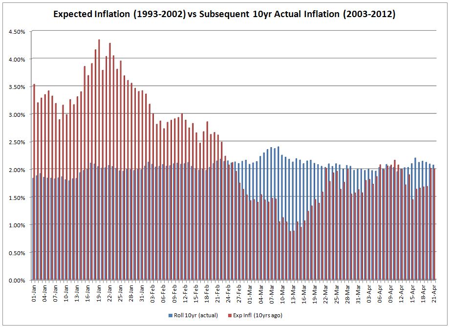
While this is as a good an estimate as any, it also hasn’t been terribly accurate.  The chart below shows how the inflation rate embedded into Canadian bond prices (i.e. inferring inflation from long Canada bonds and Real Return Bonds) at a point in time compares with actual inflation over the subsequent decade.

It’s worth noting, however, that bond prices a decade ago implied inflation of 2% annually – which is almost exactly what we’ve seen over the past ten years.  Still, the overall record doesn’t instill the most confidence.  Still, I would still rely more on bond prices than my own forecasting abilities when it comes to something like inflation.

Past Projections

Neither I nor our firm makes a habit of financial market forecasting.  But we tend to do so when markets appear to be at extremes (or when asked by journalists we like and respect).  The last time I stepped out on a limb was in late 2008 and early 2009.  I made my strongest case to buy riskier assets in a November 20, 2008 presentation to a small group of financial advisors and well-heeled investors.

Those were in the darkest days of the 2008-09 financial crisis.  But the more time I spent looking at fundamentals – and less time watching the 24/7 business news – the more I was convinced that buying stocks and high yield bonds would pay huge rewards for investors within five years.  (The rewards, it turned out, came more quickly and more furiously.)

Prior to that was a presentation I made to financial advisors on September 8, 2001 where I laid out a case for modest stock returns in the decade ahead due to high valuations.  It was all fundamentally-driven using a very similar method used for my recent calculations.

Investor Returns

Retail investors have been challenged over the past 10-15 years.  Over the past 32 years, the balanced portfolio described above has pumped out 10% per year in returns.  But that figure and my 6.5% figure are market-based estimates.  In other words, both figures are before incorporating the impact of factors that can enhance (i.e. added value from active management) or erode returns (i.e. fees, inflation, taxes, behavioural gap and value detracted from active management).

Accordingly, it’s likely that ultimate investor returns will fall short of this high level estimate.  So it’s important to take any action possible to tilt the odds in investors’ favour.

Facebook IPO separates investors from speculators

Wednesday, May 23rd, 2012

Like many, I have been watching the Facebook public market debut and post-IPO activity with great interest.  While watching from the sidelines I came across an article regarding regulatory inquiries about what went wrong with the overhyped IPO.

There may be some real regulatory concerns.  But it’s interesting that the undertone of some articles suggests that Facebook’s falling price is shocking and a sign that something went wrong.  A look at the expectations baked into Facebook’s IPO prices helps explain why its fall so far is no great mystery.

IPO Valuation

One of the reasons our firm seeks managers with some sensitivity to valuations is because many investors get seduced by a company’s story while ignoring how much the market is paying for the ‘story’.

In Facebook’s case, its IPO investors ponied up US$38 per share for US$0.43 of earnings per fully diluted share (on a weighted average basis) and US$0.49 of free cash flow per share.  That’s a trailing price-to-earnings (P/E) ratio of more than 88 times and price-to-free-cash-flow (P/FCF) of more than 78 times.

Embedded Expectations

Given these figures, IPO investors hoping to earn a long-term annualized return of 10% annually would need Facebook to grow its earnings and cash flows by 25% to 30% annually for the next decade.  In other words, Facebook’s earnings and cash flows would have to grow to 9-10 times last year’s levels.  And this is just to deliver a 10% annualized return to shareholders.

Those who purchased the IPO with the hope of higher returns – say 15% per year for the next decade – need Facebook’s financial performance to be nothing short of miraculous.  Growth in earnings and cash flow would have to hit 32% per year for a decade.

Miracles happen from time to time.  Google didn’t just achieve this kind of earnings and cash flow growth; it comfortably exceeded this high bar.  But this kind of performance is rare.  And even if Facebook does really well as a business, it doesn’t guarantee that IPO investors will be happy.

Share prices don’t follow earnings alone

Cisco Systems is the poster child for valuation risk.  It’s tough to argue with its corporate performance.  Its earnings per share have grown more than 400% over the past decade on a more than doubling of revenues.  Yet, its share price is roughly where it started a decade ago (with many ups and downs along the way).

I’m not here to opine on Facebook’s investment merit.  I’m merely putting some financial context to the Facebook’s investment story.  The price paid for an investment has a significant influence on the ultimate return to investors.  Sometimes it’s worth paying up for growth.  But being seduced by a company’s story without considering valuation (i.e.
buying at any price) is pure speculation.

——————————————–

See also:  Facebook’s quasi-IPO raises regulatory & valuation concerns (Jan 2011)

The unintended lifetime commitment

Thursday, March 29th, 2012

When entering a marriage, it’s a bad sign if you start planning your exit before vows are ever exchanged.  While many of life’s lessons extend to the world of investing, the exit strategy is a notable exception.  Unlike in marriage, investors should spend more time contemplating their exit strategy to help avoid the unexpected liquidity trap.

Labour sponsored funds

A lucky contingent of labour sponsored investment fund (LSIF) investors bought in the mid-1990s.  They were lucky because when the mandatory holding period expired, LSIFs’ strong performance allowed them to sell at a healthy profit.  But LSIF investors that jumped in after the winter of 1997 drew the short straws.

With a longer holding period that ended in a bad environment for LSIFs, many later investors either lost money or became locked-in well past the minimum eight-year holding period.  Many investors still hold LSIF shares that should have ‘expired’ years ago; forcing some to hold on for a dozen years and counting.

Frozen LSIFs include the former VenGrowth funds acquired by Covington last year and GrowthWorks Canadian fund.  (This list would be lengthy if including those funds that were amalgamated or folded.)

Other specialty funds

Hedge funds can sometimes be difficult to exit.  Initially there may be a ‘lock-up’ period – i.e. where you can’t sell for a year or two after the initial investment.  Subsequently, quarterly redemptions are common, with 30-120 days of advance notice.  But like LSIFs, hedge funds often have clauses allowing them to freeze redemptions – i.e. a “gate” – when doing otherwise is deemed harmful to remaining fund investors.  While this is normally associated with hedge funds, virtually all funds have gates.

A prime example is the class of open-ended real estate mutual and segregated funds (unlike private real estate investment trusts and limited partnerships) given that they ‘house’ very illiquid assets inside of a very liquid mutual fund structure.  A liquidity crunch hit real estate funds in the early-to-mid 1990s and again a couple of years ago.  When a stampede of investors tries to sell their units at once, sponsors will freeze redemptions to control liquidity.

While investors have fallen into liquidity traps in specialty investment funds in the past, some investors are finding themselves stuck in more traditional funds.

Closed-end funds

Traditional closed-end funds function like mutual funds but trade like stocks.  Unlike an exchange-traded fund (ETF), sellers of closed-end funds must find a sufficient supply of buyers to exit.  This is why most publicly-traded closed-end funds trade at a price below the value of its underlying investments.  Of the 157 closed-end funds for which GlobeInvestor.com lists discount and premium data, 115 recently traded at a discount to their net asset values.

There are many examples of mainstream closed-end funds with thin trading volume.  Urbana Corp for instance had recent trading volume equal to $5,800 per day.  Trident Performance Corp II recently traded an average of less than $9,000 daily, which is fine for small investors but very illiquid for larger sums.  These and many others can go days and weeks with little or no trading, making it difficult at times to get out of these funds.

Two closed-end funds offered by ABC Funds – North American Deep Value and Dirt-Cheap Stock Fund – are unique funds in which some investors feel stuck today.  These don’t trade on a public exchange so ABC Funds maintains an internal “virtual exchange” whereby it matches hopeful sellers with willing buyers.

In recent weeks, ABC’s website said that roughly 90 investors were looking to sell out of each of the firm’s closed-end funds.  But not one investor was ready to pony up the $50,000 minimum needed to buy existing investors’ units – and hasn’t for some time.  ABC has facilitated some modest selling but a line-up of eager buyers is needed to ease the long list of those waiting to exit the funds.

Since these funds were launched when their manager – Irwin Michael – was on a relative performance high, most probably never thought a time would come when nobody wanted to invest in the funds.  I find it hard to believe myself but suspect that patient investors will be rewarded in time.  However, those wanting to liquidate are stuck for now and may be in an unintended lifetime commitment.

The next potential liquidity trap

The aforementioned list of past liquidity traps can help to uncover the next one.  While the above list of investments couldn’t be more different from each other, they share two important commonalities.  First, while the specific factors driving their popularity varied, there were specific periods in time when each of the aforementioned investments were very popular.

Second, investors appear to have downplayed the liquidity risk of each.  For example, it’s common knowledge that property can’t be quickly or easily liquidated.  So allowing investors to frequently buy and sell property funds only works while the investment is in favour.  And I suspect that investors never imagined such an imbalanced supply-demand ratio.

So the next liquidity trap is likely to be a popular class of investments today that hold very illiquid investments.

Accordingly, private mortgage funds could be the next liquidity trap but not until their popularity abates.  These intriguing funds are gaining in popularity thanks to juicy yields and claims of rock-solid unit prices.  While our firm is starting to examine these funds – and there are lots of them – here is some food for thought.

Many such funds claim that unit prices (or capital value) are constant – a suspicious claim on the surface.  Funds that invest in bond-like investments are short-changing either buyers or sellers by not adjusting unit prices to reflect changes in interest rates (and credit spreads).

More generally, you don’t get an 8% yield in a 2% interest rate environment without taking significant risk.  Risks include credit risk, interest rate risk and liquidity risk.  Don’t underestimate any one of those (or other) risk factors, particularly liquidity.  Case in point:  ROI Capital recently froze redemptions on four private placement pools that generally bear some similarities to private mortgage funds.

According to this press release, ROI froze redemptions after one large source of inflows dried up.  ROI claims that there are no defaults or other big negative events affecting any of the funds’ investments.  But you hit a bottleneck when you have much more money wanting to leave than you have coming into a fund that invests in illiquid assets.

Prior to investing, evaluate risks under less favourable scenarios by asking pointed questions.  What is the impact of rising interest rates on the market value?  What happens when many want to sell but nobody wants to buy?  How much might I lose when loan defaults hit 5 or 10 percent?  Asking and getting answers to these and other questions just might help you avoid an unintended marriage to your next investment.